.png)

.png)
.png)
RideMates is a mobile app that connects students with carpool drivers by reinventing carpool applications in terms of class schedules and universities. Students can book rides in advance safely while knowing their carpool drivers background through the necessary university student information requirement. The app provides and efficient way to help students reach classes on time through an easy portal.
.png)
.png)


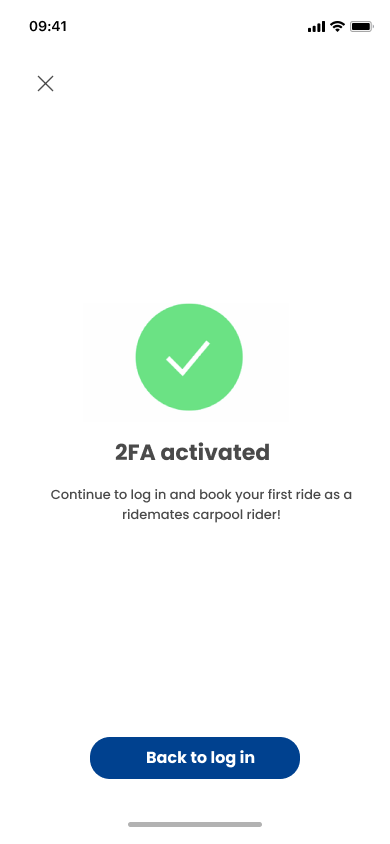
Focusing on the values of providing users authenticated safety, upon signing up users are provided verification steps by providing university and contact details proceeding to activated 2 Factor Authentication through DUO Mobile used across universities in Ontario, Canada.
.png)

.png)
.png)
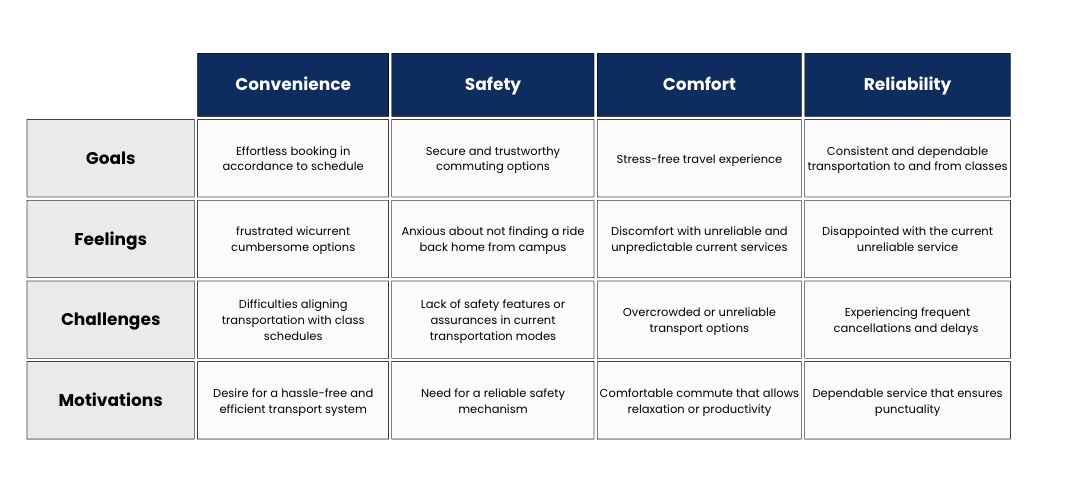
I sent out a user using Google Forms and received 60 responses.
Here’s what users said when asked about using various transports to reach campus.
Class timing do not always align with finding a carpool reaching right before the class or it's just too expensive.
Most carpool drivers are unreliable as their main focus is on traveling city to city (far distances).
A lot of the times if I have an evening class when taking an Uber I feel a sense of security is missing.
They are also...unreliable as they could cancel at any time causing the student to miss class.

These are the 2 digital transport booking tools that came up most often in survey responses. My goal was to compare what features they had to offer in order to identify gaps and opportunities for improvement.

Students may need an easy and convenient method of transportation to go to class. Most students struggle to find a car ride to university in accordance to the time of their class.
To address the users pain points I decided to design a carpool application with an option to connect with drivers through class schedules. It would make the app a “one-stop” to plan and book daily carpool rides. The planning feature would let users:
I started by sketching some user flows and early wireframe ideas.

This section demonstrates the designed solution, from the style guide to a high-fidelity prototype. Figma was used as the design tool.
I kept the colors simple and chose a modern style which is easy to read on all screens, incorporating a warm tone of blue and yellow representing safety and comfort.
.png)


.png)
Focusing on the values of providing users authenticated safety, upon signing up users are provided verification steps by providing university and contact details proceeding to activated 2 Factor Authentication through DUO Mobile used across universities in Ontario, Canada.