The Project

Many parents, especially mothers from low-income or single-parent households, miss or delay medical appointments due to a lack of accessible childcare. This negatively impacts both healthcare outcomes and system efficiency.
Role:
UI/UX Design Team (3 designers)
UX and Market Research (4 researchers)
Date:
12 Weeks
Skills:
Figma, Figjam (Prototyping, Design Systems), Miro, Excel (User research: Pain points)

The Solution

CareBridge — a digital service that connects parents to local hospitals offering on-site childcare, enabling stress-free medical visits. The platform supports:
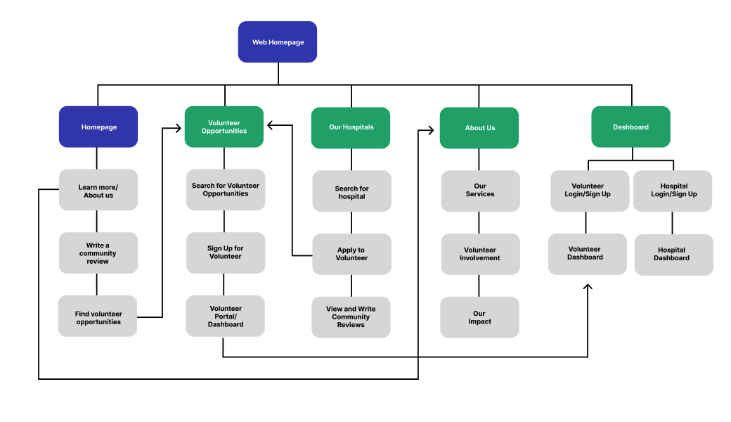
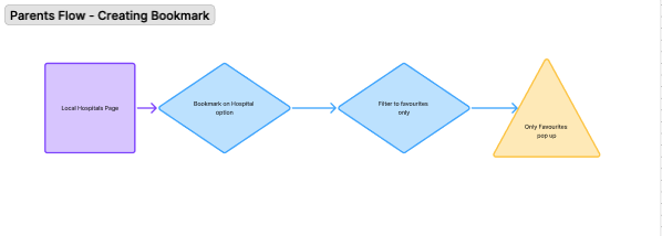
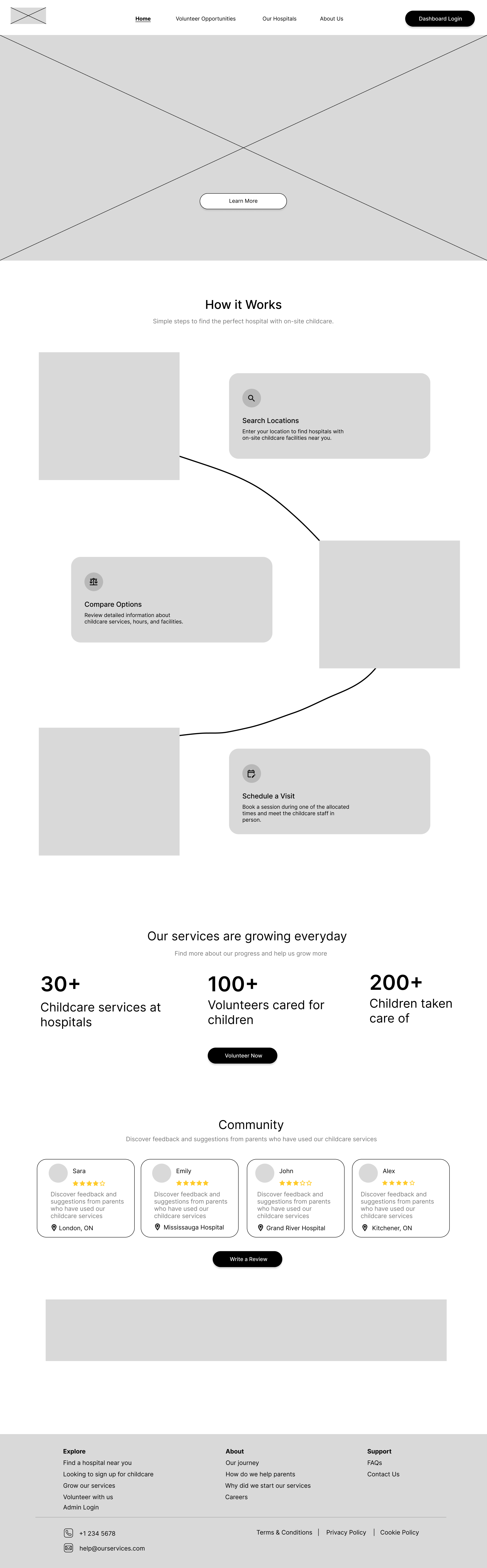
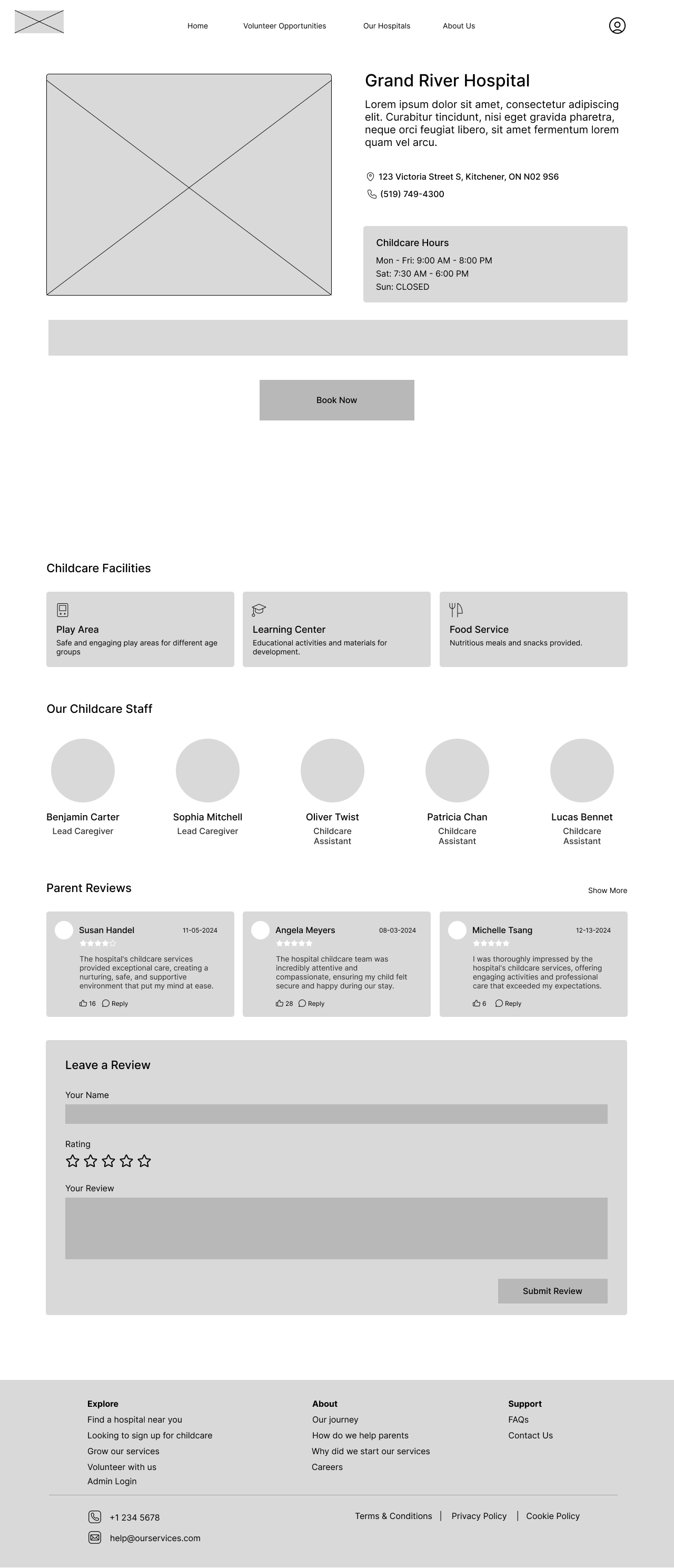
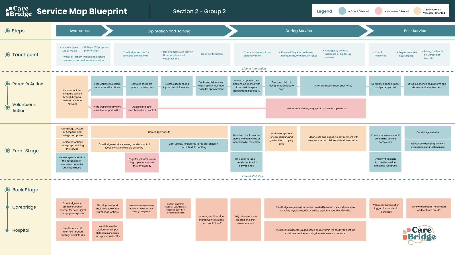
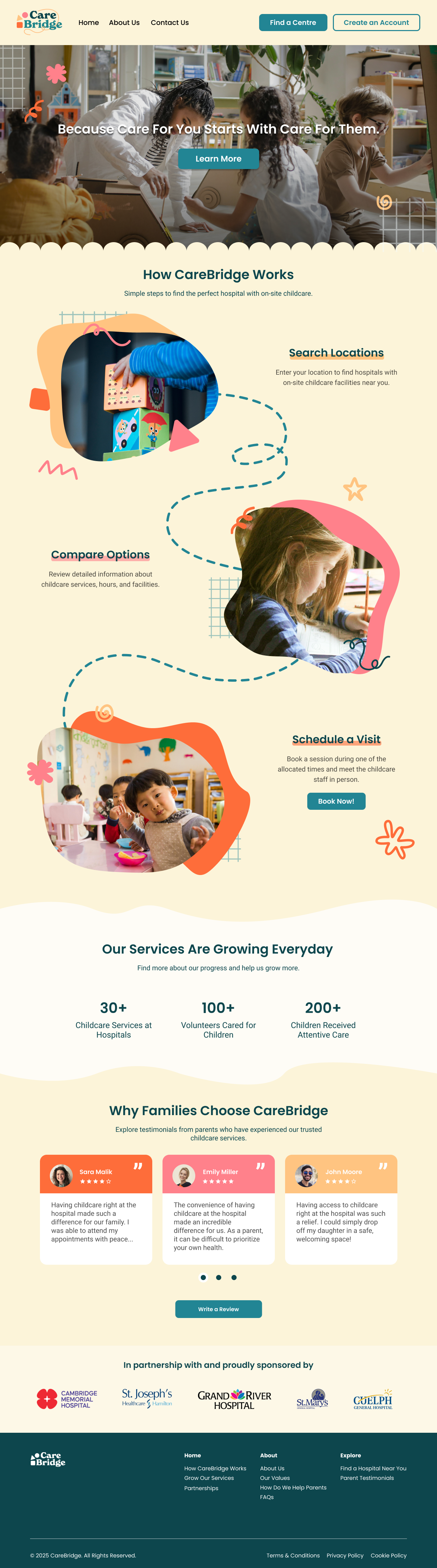
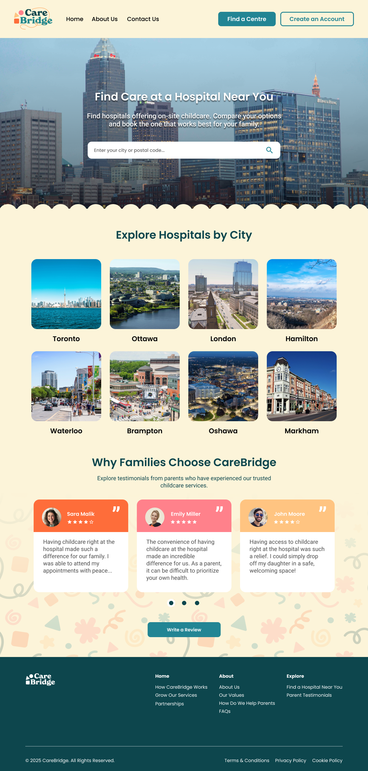
  • Discover nearby hospitals with childcare support

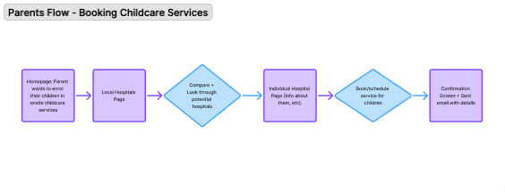
  • Easily book time slots for childcare

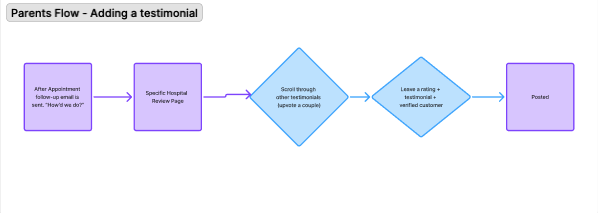
  • Submit testimonials and reviews

  • Coordinate volunteer caregivers behind the scenes
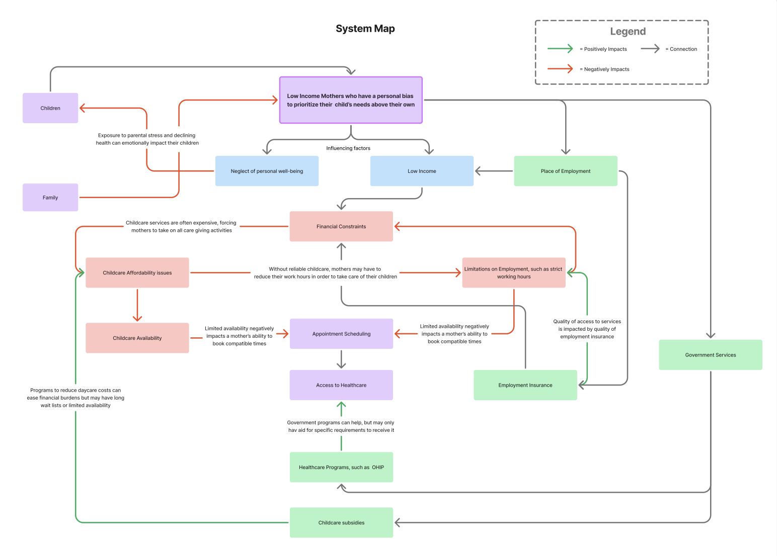
Part 1

Discovery Research and Understand User

Qualitative and Quantiative Research
Key Insights
Part 2

Define and Ideate

We refined our scope to focus exclusively on the parent-facing experience, instead of also targeting hospitals and volunteers.
Information Architecture
Parents Task Flow
Part 3

Design Process

Low-Fidelity Wireframes
We began with the sketches of : Homepage, Hospital Info Page, Review Submission Interface, and Time slot booking Calender
Branding and Design System
A user friendly yet trustworthy visual identity aligning with the range of users we are providing this service to
Service Blueprint
Part 3

Usability Testing

Testing Format
We conducted 3 rounds of moderated usability tests using think-aloud protocols and semi-structured interviews.
Partcipants: 6 users, mixed tech backgrounds, mostly parents
User Tasks:
Key Feedback Themes
User testing revealed several usability pain points in the initial prototype. Participants often missed key content on the hospital page due to unclear scrolling cues, and the “Write a review” button caused confusion by not directing users to the intended section. Many users relied heavily on the footer for navigation, which exposed issues with inconsistent or non-functional links. On a positive note, the platform’s visuals, including hospital imagery and thoughtful color usage, received strong praise for enhancing trust. However, the booking process felt lengthy, particularly the step requiring insurance details, which some users found unnecessary or cumbersome.
Impact and Results
System Usability Score
  • Final: 97.25 (+40% improvement)
  • Initial: 56.25
Key Feedback (Before Iteration)
  • Some users didn’t know to scroll on hospital page
  • FAQs found easily, but footer links were buggy
  • Review section was hard to find
  • Visual hierarchy appreciated (e.g. hospital imagery)
Iteration Summary
  • Made CTA buttons more prominent
  • Fixed non-functional footer links
  • Improved accessibility contrast
  • Added hospital photos + trust-building bios
Part 4

High-Fidelity Prototype

Parents flow - Information Discovery
Parents flow - Booking Childcare Services